Cette page n'est pas encore traduite
My dream Win 9 “Workstation”
Windows 8 is seen as the worst move by Microsoft by a lot of people. For me, it’s more like a potentially good idea which missed the target. It’s perfect for tablet, so so for personal computing and useless for a workstation.
My idea is based on the way I use a computer for software development. I’m always using a few windows, some side by side and others that I’m switching between. The system I imagine is one I think would help maximize the use modern apps while still using the classic desktop applications.
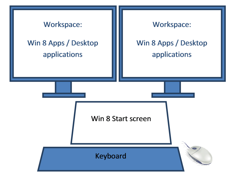
The hardware setup I would like for my Workstation

Workspace | One or more screen to use as the workspace, touch or not (The classical setup) |
Start screen | That’s the addition, a touch screen (10” to 20”) that will always show the Win 8 start screen. The screen would be just after the keyboard with a small inclination for easy access. Since it will be accessed by touch. |
Keyboard / mouse | Nothing new, just the old keyboard and mouse |
The replacement for the desktop/metro screen
My idea for the UI, is to replace the desktop concept by a new Workspace concept. I heard that there are tools offering something similar, but I will simply describe my vision. Of course Win8 apps and desktop apps would all work the same, no more different behavior from the two of them.
For my workspace concept. I use the term "case" to identify each section of the screen defined in a "workspace"
With a tablet, the workspace is simply 1 case that contains the start screen and the applications. That setup (which is the current one), would become the default workspace for one screen.
Multiple workspaces will be used on a system. We need to be able to switch easily between each one. Each workspace is dependent on the screens setup. Unplug all external screens on a laptop and you have only access to your 1 screen workspaces. Plug one or more monitors, you now have the workspaces planned for those monitors. Plugging 1 external monitor or 1 TV create the same number of "screens", but a different workspace should be used because it's not the same monitor (Checking the monitor name should be enough).
Default workspace would be 1 case by monitor or create a copy of the current workspace and add 1 case for the new monitor.
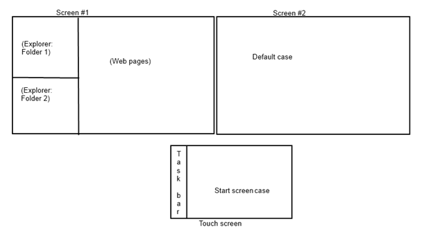
We need few default cases to be configured in a workspace. The start screen case and the default case (for when you open an app). Each case can be assigned any number of applications. An unpinnable tabs bar (at the top of the case, or configured else where) would be used to switch between theses windows. If you unpin the tabs, you can still switch window from the task bar or show the tabs from moving the mouse to the top (like the title bar in remote desktop) or a gesture.
One click in the start screen on an application that is not opened will open it in the “default case”. Drag and drop from the start screen will be used to open it in another case. The Windows+Arrow would be used to move the current windows between the cases.
Example of my workspace configuration on a 3 screen setup:

Edition of workspaces
Few buttons that could be on the start screen: Choose workspace, design workspace, and create workspace.
Choose workspace would pop a preview of the different workspace structure for the current monitor’s configuration to allow selection which one to use.
Design workspace would allow to resize/add/remove cases. It would also allow moving apps from one case to the other and the selection of the “Start screen case” and the “Default case”.
Create workspace would clone the current workspace or create a new one with one case by monitor, and show the workspace designer to adjust it.
Changes to task bar
The task bar should stay highly configurable, nobody likes the same setup. A new grouping would be required. The way I see it, we need to group them in four groups. The active applications in the current workspace, the active applications in the other available workspaces, the active applications without workspace (happen when you switch monitor configuration) and finally the inactive pinned applications.
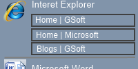
I would like to see a new way to regroup different windows of the same application. There is a lot of way to see it, but I would like a big icon follow by a smaller title of the program, then a list of clickable window titles. I would place that bar vertically at the left of the start screen. (Of course customizable by user)

Commentaires
J'utilise le système de facebook pour éviter d'avoir à coder la gestion des commentaires.
Ils sont différents en français en en anglais.